Working on the Novel
I love storytelling, both visually and through written word. So naturally, when I decided to self publish the novel I had been working on for ten years, I began researching and developing the skills necessary to create my very own book cover. This is the progress I took to go from concept to finish.


Starting with a Symbol
Because the main genre of my book is paranormal, I knew I wanted to have the moon as main feature with the rose to hint toward the romance that is suggested in the relationship of the principle characters. The sword I added later when I drew the symbol for my book again ten years after the original drawing was finished; it represents their struggle and is a key weapon of choice for the male protagonist.
Sketching the Idea
I choice not to stay with my signal symbol design because my research showed that most books in my genre that had symbols tended to spread to the edge of the cover.
With that in mind, I sketched twelve possible ideas before settling on a mix of concept three and seven while including the font inspiration from my second concept.


Developing a Font
After exploring a multitude of options from both free and paid sites, I came to the ultimate conclusion that the style I wanted did not exist, so I would have to create it myself.
I found a font building website and drew up the concepts for each letter then scanned and uploaded them into the font building. After tediously smoothing and shaping out the flaws, I settled on a name for my new font and downloaded it then uploaded it into Photoshop.
The name of this font is Tainted Knight.
Post Project Note: If I were to do this again, I would make the letters thicker because as seen later in the project, it is hard to read in small print. I also would have adjusted the letter spacing in several places.
Tainted Knight
Finding References
I gathered stock images which I'd be able to pull from and reference as I created my cover in Photoshop.
I knew I wanted a dark forest, a rose, and a rapier on my cover, as well as possible figure in the shadows.


Creating Digital Elements
I created all the elements for my cover in Photoshop using techniques I learned in video tutorials to make the rose look like an illustration and create a shadowed figure from the image of a man.
None of the rapiers I found online had the look I wanted, so created one. I pieced elements from several stock images and built the blade with variants of grays and blending tools.
The vines I created from scratch in Affinity Designer (which functions the same as Illustrator) and uploaded to Photoshop to overlay the sword and the rose.
Original Mock Up
I created the background by overlaying several stock images and using layer masks to blend them together.
Unfortunately, it came out extremely dark which I learn until I printed it because in Photoshop it appears much brighter.
In this phase, I still had several points to work on including the size and placement of the title, the readability of the text, the odd separation between the cover and the spine, and a good design for the back of the book.


Second Mock Up
I decided to put my original symbol on the back of the book and fixed the spine and cover separation as well as the size and placement of the title.
I brightened in quiet a bit, but it only helped slightly with the readability, and I wasn't overly fond of the bright green.

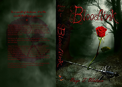
Final Product
Market research taught me to tone down the green with a layer of gray, allowing my book to allude to the more mystery subgenre it leans towards.
But there were still improvements to be made. After receiving some much needed feedback from peers, I made the rose and rapier larger, allowing them to be a better focal point and tie the whole cover together.
However, talking with a marketing coach made me realize that as much as I loved the font I created, it had to go along with the red text I was partially to because not only was it hard to read in small print, it didn't match the look of many of the books in my genre. It was a difficult change to accept, but one I am glad I chose to listen to. The book cover looks ten times better and is easy to understand.